Designing a new default newsroom theme for Prezly
Redesigning the newsroom experience to be faster, more flexible, and better at showcasing our customers' stories.

In parallel, we overhauled the theme settings with a new styling page and a proper live preview, while adding requested functionality like new layouts, better search, and improved sharing tools.
The two-phase rollout led to ~96% of customers adopting the new theme and reduced theme-related support by more than 50% across both phases. Published: Yes
For a long time, Prezly’s default newsroom theme hadn’t seen a real update — almost eight years without a major redesign. In internet years, that’s a lifetime, and the cracks were showing. The design felt outdated, the code was aging, and it no longer matched the quality of the stories our customers were publishing. More importantly, it didn’t help them look good.
Slow, outdated and old
Newsrooms were slow, hard to customise, inaccessible by modern standards, and visually flat. Customisation wasn’t much better: options were limited, previews didn’t update in real time, and users often didn’t know what each setting controlled.
The old theme had clear layout, alignment and sizing issue. Additionally, (for some reason) we were showing just 5 stories on the homepage.
The old theme had clear layout, alignment and sizing issue. Additionally, (for some reason) we were showing just 5 stories on the homepage.
What should have been one of the most visible and inspiring parts of the product had become something you didn’t really want to show.
Starting from the beginning
It was clear that small tweaks wouldn’t fix this. Between outdated code, restrictive settings and a lack of flexibility, we needed to rethink both the newsroom itself and the way users configured it.
Internally, we called the new theme Bea, named after my daughter — mostly because the project kept me up at night as much as she did.
Designing a new default theme
The first step was understanding how people — both Prezly customers and external brands — used newsrooms.
We started by auditing dozens of Prezly newsrooms and identifying common patterns. Then we extended the research and studied over 100 newsroom examples from companies like Airbnb, Meta and Apple to understand what “great” looked like.
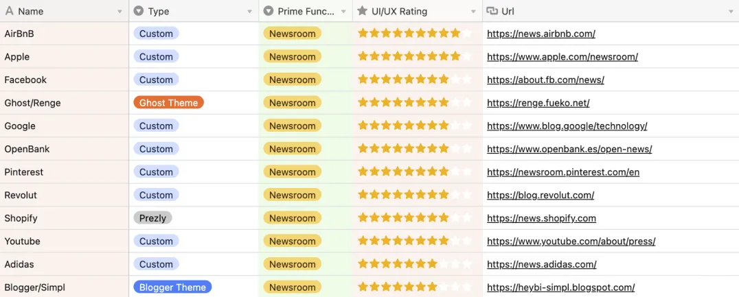
We’ve evaluated newsrooms from 1→10 stars and tried to understand the technology behind.
From this research, a few clear principles guided our approach:
- Images needed to lead the layout — more than 90% of stories include visuals
- Latest stories are the most important — many customers even remove older content
- The theme had to scale — some newsrooms have 2 or 3 stories, others have 200+
- Design should stay out of the way — the content should be the hero, not the theme
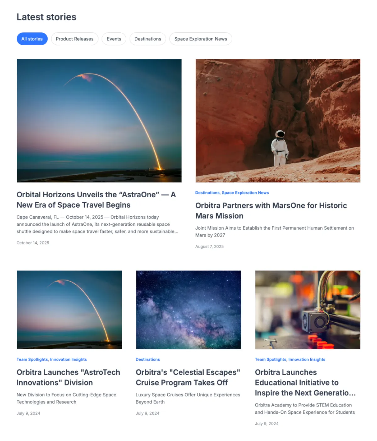
Starting with a grid, like a proper designer
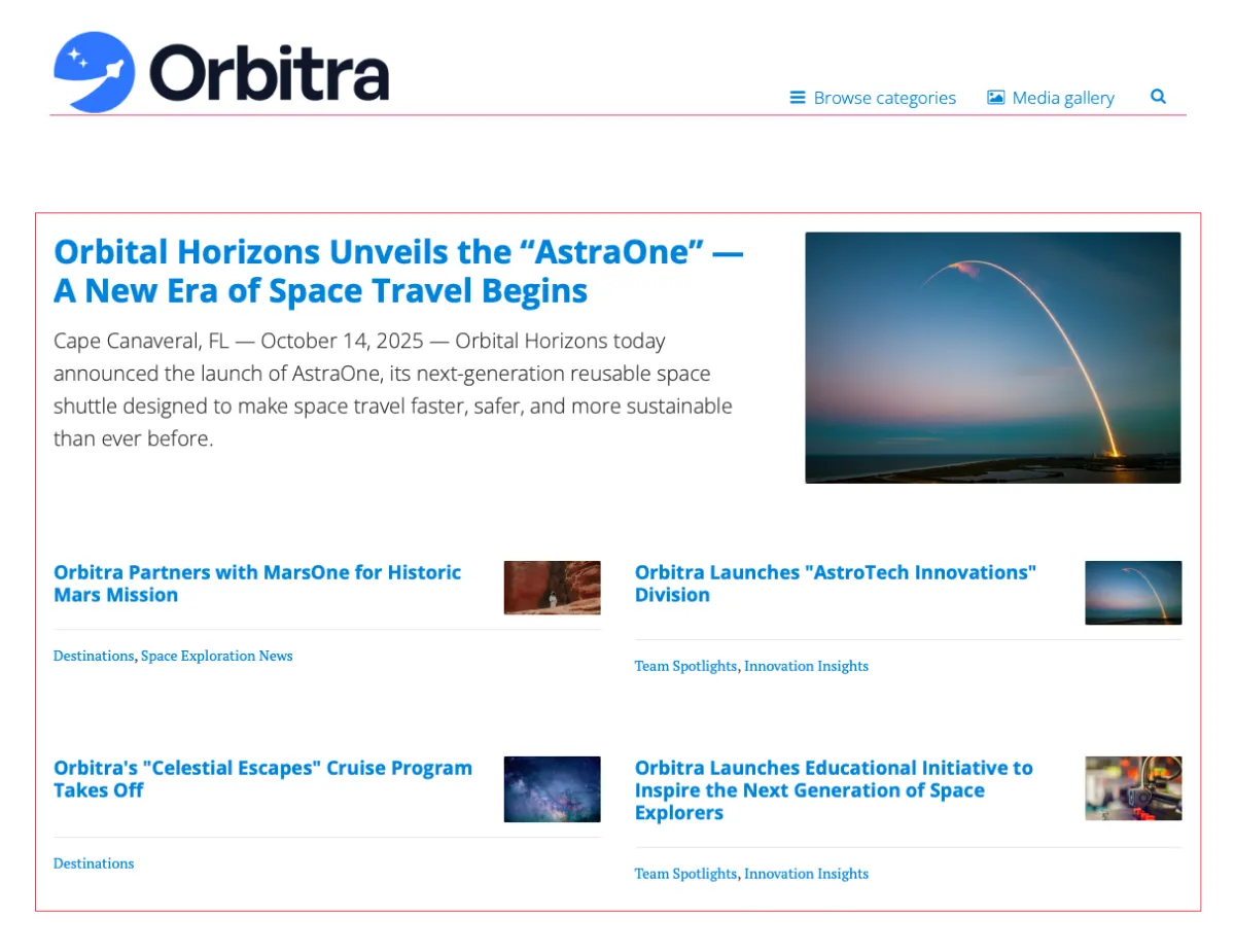
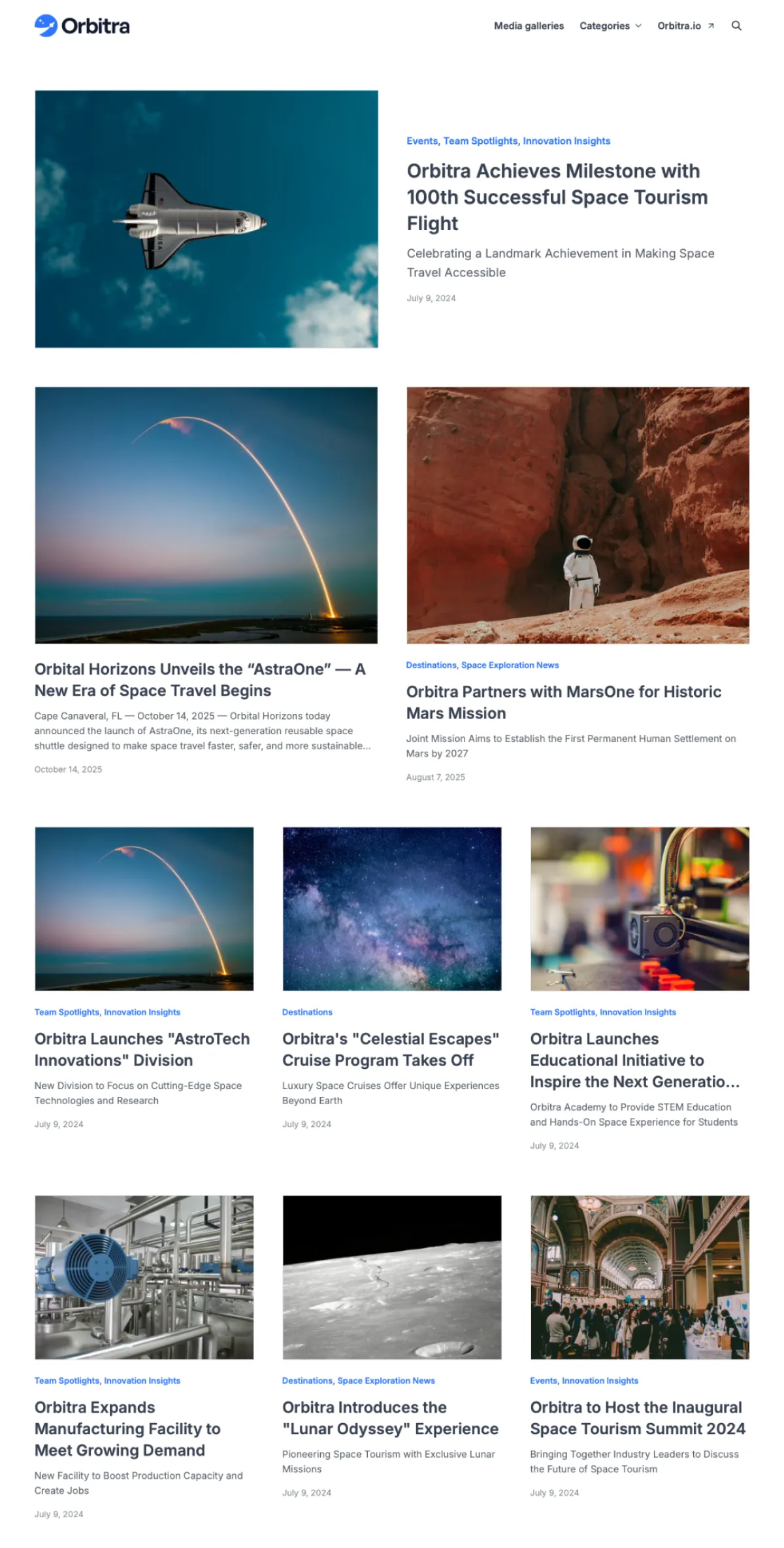
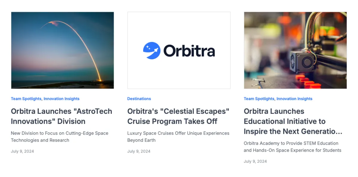
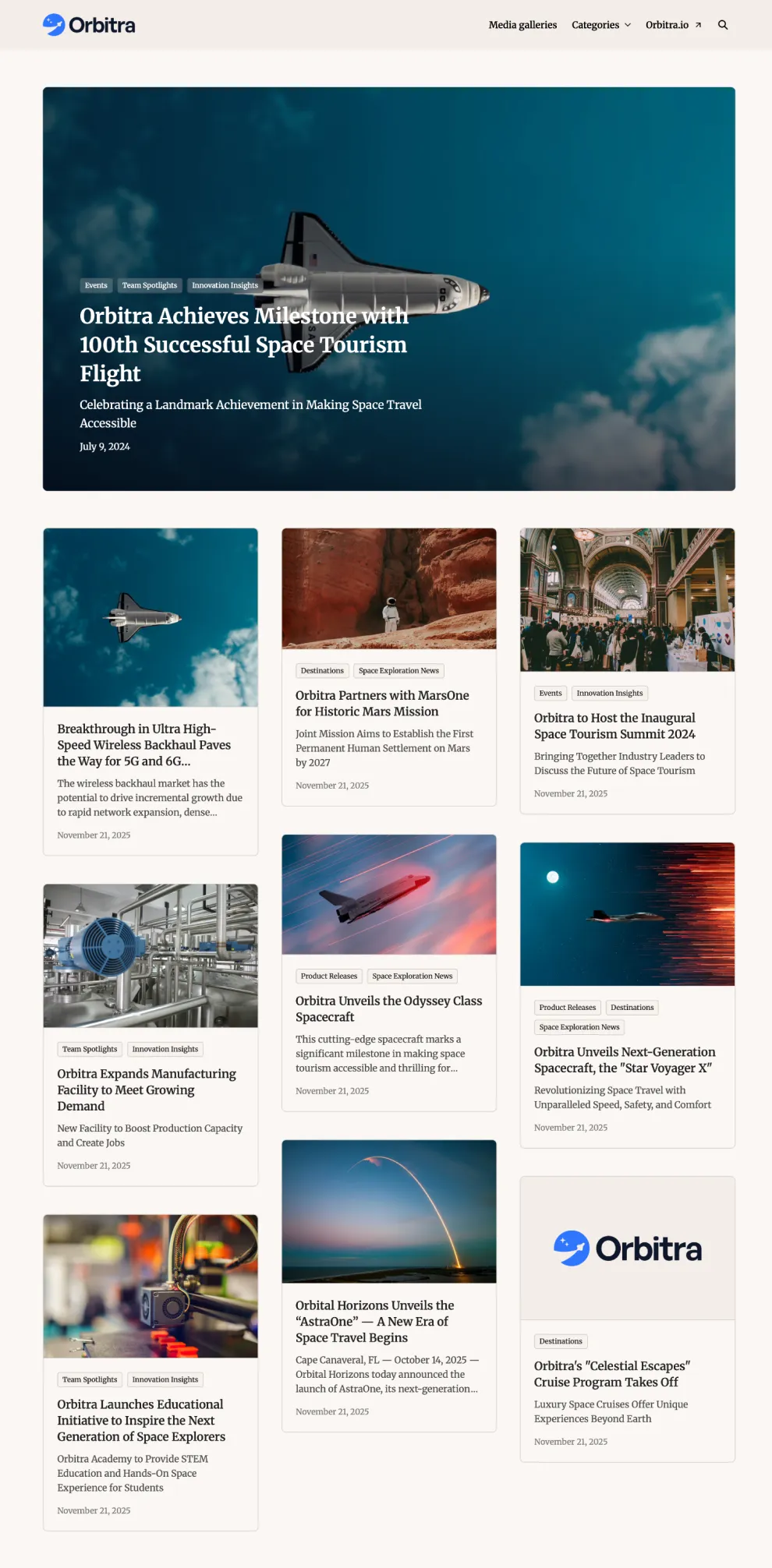
To support these principles, we began with the new theme’s grid. The layout includes a large hero card (the latest story), followed by two medium-sized cards, and then a grid of nine smaller ones — giving visitors the twelve latest stories directly on the homepage.
In addition to the increase number of stories being displayed, we also fixed some other alignment and sizing issues (eg. logo and nav links)
This not only kept the latest content front and centre, but also created a natural hierarchy between stories based on their publishing date.
For newsrooms with categories, we not also improved the category nav-bar dropdown (with category images).
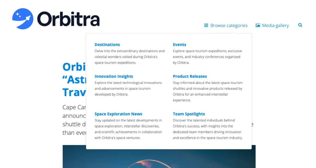
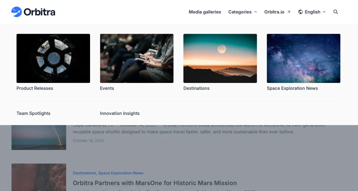
Previously, the categories were shown in a simple dropdown, that was hard to readIn the new theme (as an option) we added images to categories and placed them in a mega menu, to make them more appealing.
Additionally, we've also built an optional horizontal category picker directly on the grid, allowing users to filter stories by category directly on the homepage.
This picker is also optional and can be enabled/disabled in site settings.
Content-proof layouts and great defaults
Since Prezly newsrooms can have one or one hundred stories, every layout needed to adapt. If there’s only one story, we show a single card. If there are two, the grid adjusts automatically.
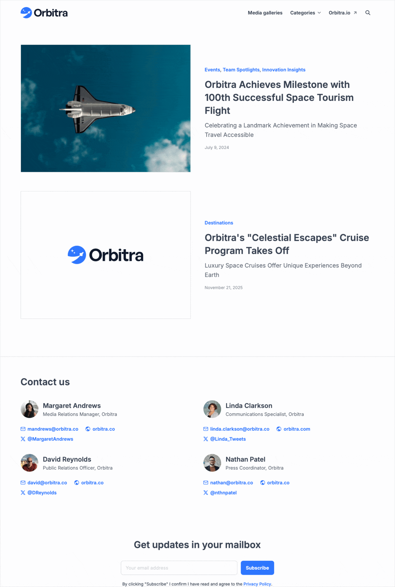
We also needed to prepare for “low-content” cases. In our research, we found many stories without images. For those, the card falls back to a layout using the newsroom logo and brand colour to keep things visually consistent.
We added other smart defaults so users didn’t have to make dozens of decisions every time they updated their theme, such as:
- One accent colour generating lighter/darker shades automatically
- A header that adapts to different logo sizes
- Inter as the modern default font, plus a curated list of safe alternatives
“New” and improved features
Search also got a complete overhaul. We added a faster quick search, a clearer results page, and improved filtering to help visitors find content more easily.
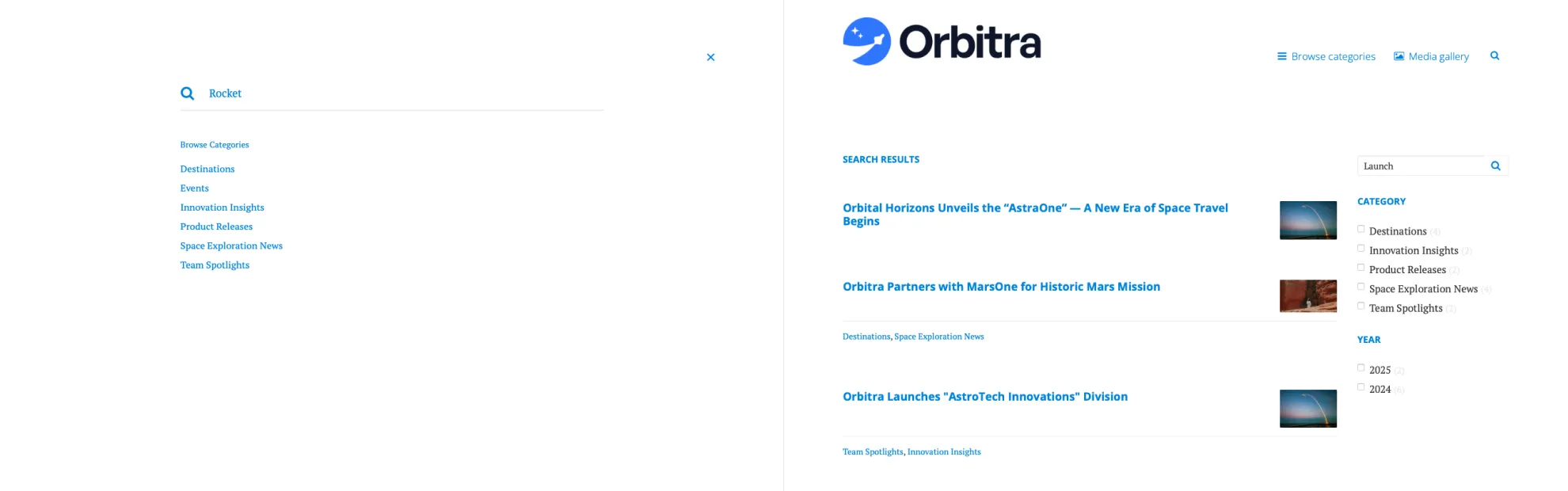
Old theme’s search modal covered the whole page and didn’t provide instant results. Visitors always needed to go to search results page.
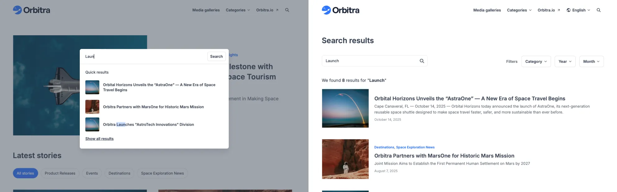
The new theme search doesn’t occupy the entire screen and provides users with content of where they were. Additionally it provides instant search results. The search results page was also restructured and includes a better filter selection and “combinator”.
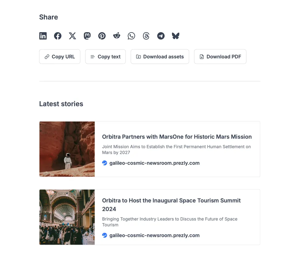
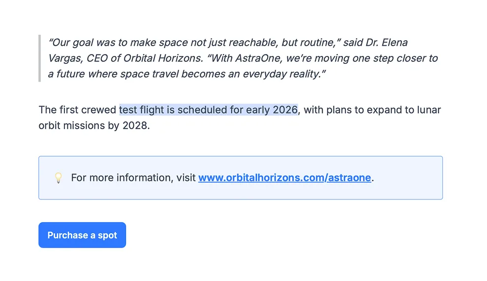
Beyond improving existing features, we introduced new functionality to help both newsroom owners and their visitors share stories with less friction:
- More social sharing options
- Buttons to “Copy text”, “Copy URL”, “Download assets” and “Download as PDF” on story pages
- A “Latest stories” section added to the bottom of each story page
- A featured categories block (optional) on the homepage
Flexing it out
Not all of these features were launched at once. They were gradually introduced over two phases, and user feedback quickly made something clear: good defaults work for most people, but power users want flexibility. To give them the control they needed, we had to rework the site settings as well as the theme itself.
We brought over customisation options users missed from legacy themes, including:
- Background colour controls
- Story card styling and grid layout flexibility
- Additional font options
A color change, combined with a font change and some small layout option tweaks, can give Bea a completely different look & feel.
We also added new functionality directly requested through interviews during the theme transition — things like justified text alignment, buttons, callout blocks, logo size controls and text highlight.
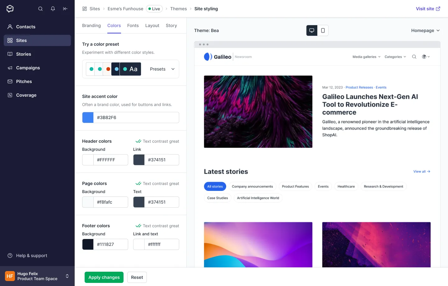
A new site styling page
Until this point, theme styling was done in a “theme settings” sidebar without any live preview. Some of the settings were even scattered across other pages, like “Branding” for the logo or “Categories” for category layout.
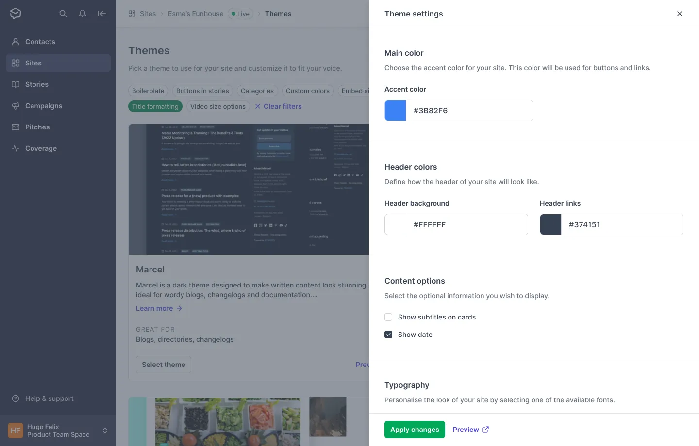
To bring everything together, we created a new styling page called Layout & Styling. In this page, users can configure every visual aspect of their newsroom and enable or disable specific functionality.
The page is divided into two main sections:
- Theme options: A panel with tabs for Branding, Colours, Fonts, Layout and Story
- Live preview: A real-time preview for fast, confident experimentation on desktop or mobile
A better theme makes everyone happier
By the end of phase one (and before starting phase two), around 32% of all Prezly newsrooms had already moved to the new theme. Phase two “ended” in March of 2024, and by October of that year, there was only one (non-custom) theme remaining in the old infrastructure.
Another positive result was the reduction in theme-related support volume. After phase one, theme-related support dropped by 22%, and phase two brought an additional 32% reduction. This wasn’t only due to the theme itself, but also to the improved documentation and direct links to help resources from within the app.
An ongoing effort
Newsrooms (and their themes) remain one of the most important and highly visible parts of Prezly, so we continue improving them. Recent updates include optional header-image placement, pinned stories and hub-room support, but there’s still work to do around empty states and how categories are displayed.
If you wonder how the theme looks like in the wild…
See it live
Conclusion
Bea wasn’t just a visual refresh. It was a deep, structural upgrade to one of the most public parts of Prezly. It pushed us to rethink how we design defaults, how we build flexibility, and how we balance power with simplicity.
It took time and multiple iterations, but the end result is a faster, more modern and far more capable newsroom experience — one that finally reflects the quality of the content our customers publish. And naming it after my daughter still feels right and makes me proud.
If you want to talk more about this project or dive into any of the solutions, feel free to reach out. I’d be happy to share more.